

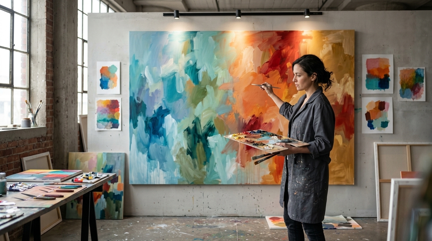
The Psychology Behind Colors in Art: Why a Single Color Can Change What You Feel
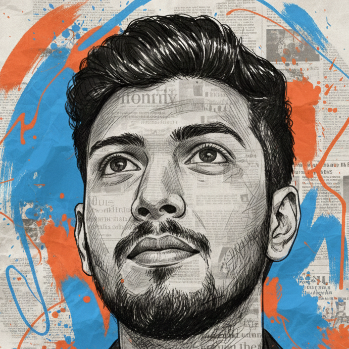
- Before you understand a painting, you may already be reacting to it.
A deep red can make an artwork feel intense. A soft blue can make the same scene feel quieter. Bright yellow can create energy, while dark, muted tones can make an image feel mysterious or reflective.
But there is a common misconception about color psychology: blue does not automatically mean sadness, and red does not automatically mean anger.
The emotional power of color is more complicated—and that's what makes it so fascinating.
Recent research published in Frontiers in Psychology in June 2026 examined more than 4,000 artworks and hundreds of thousands of emotion annotations. The study found meaningful relationships between artistic themes, color characteristics and viewers' reported emotional responses. Cool colors such as blue and green were associated with calmer, more contemplative emotions, while warm colors such as red, orange and yellow were associated more often with pleasant and exciting emotions.
So how does color actually influence the way we experience art?
Color Speaks Before Words Do
Imagine looking at a painting without knowing its title, artist or story.
Before you identify the subject, your brain is already processing shapes, contrast, brightness, movement and color.
Color can help establish the emotional atmosphere of an artwork almost immediately.
An artist doesn't need to paint a frightening scene in order to create tension. A dark palette, strong red accents or dramatic contrast may be enough to make the viewer feel that something is happening.
Likewise, an ordinary landscape can feel peaceful when painted with soft greens, blues and gentle light.
Color isn't simply decoration.
It is part of the visual language of art.
Red: Energy, Danger, Passion—and More
Red is one of the strongest colors emotionally.
It can suggest:
- Passion
- Love
- Anger
- Danger
- Energy
- Urgency
- Power
But there is no universal rule saying “red means anger.”
Research on color-emotion associations has found red linked with anger, but also with love and other emotional concepts. The meaning depends on context, surrounding colors and the subject of the artwork.
A red rose and a red warning sign communicate completely different ideas—even though the color is the same.
That's an important lesson for artists:
Color gets its meaning from context.
Blue: Calm or Sadness?
Blue may be the perfect example of why color psychology shouldn't be reduced to simple rules.
Blue is often associated with calmness, serenity and contemplation. Recent research involving visual art also found cool blue-green palettes clustering with calmer emotional responses.
But blue can also represent sadness.
Think about the difference between:
Soft sky blue + sunlight + open landscape
and
Dark blue + empty space + low light + isolated figure
The color family may be similar, but the emotional experience can be completely different.
The artist controls the story through shade, saturation, brightness, composition and subject matter.
Yellow Can Bring Light Into a Painting
Yellow is often associated with happiness, warmth, energy and optimism.
It can make a painting feel bright and alive.
But intense yellow can also become visually demanding when used in large amounts or at high saturation.
This is where understanding color properties becomes more useful than memorizing color meanings.
Color isn't only about which hue you choose.
It is also about:
How bright is it?
How saturated is it?
What colors surround it?
How much of the canvas does it occupy?
Those decisions can dramatically change the emotional effect.
Green: Nature, Balance and Renewal
Green is strongly connected with natural environments, which can make it feel refreshing, organic and peaceful.
Landscape paintings often use green to communicate life, growth and harmony.
But green can also suggest completely different ideas depending on the context—such as illness, envy or artificiality.
Again, there is no single emotional dictionary for color.
The surrounding visual story matters.
Black and White Can Change the Entire Mood
Remove most of the color from an artwork and something interesting happens.
The viewer becomes more aware of:
- Light and shadow
- Shape
- Texture
- Contrast
- Composition
- Facial expression
- Symbolism
Black can create mystery, seriousness, elegance, grief or power.
White can suggest simplicity, purity, emptiness, peace or isolation.
Put black and white together with dramatic contrast and an artwork can feel completely different from a colorful version of the same composition.
Saturation Can Make an Emotion Louder
Imagine two paintings using the same red.
One uses a soft, muted red.
The other uses an extremely vivid, highly saturated red.
They may communicate completely different feelings.
Research summarized in the 2026 art-and-emotion study indicates that saturation and brightness can influence emotional responses, with highly saturated colors tending to produce stronger emotional experiences.
This gives artists another powerful tool.
If you want a color to quietly support the atmosphere, reduce its intensity.
If you want it to demand attention, increase its saturation.
Brightness Changes the Emotional Temperature
Brightness can dramatically alter how a color feels.
A pale blue can feel airy and peaceful.
A dark navy can feel serious or mysterious.
A bright orange can feel energetic.
A dark brown-orange can feel warm and nostalgic.
The hue hasn't necessarily changed dramatically.
The emotional environment has.
This is why experienced artists rarely think about color as isolated swatches. They think about relationships.
Colors Don't Exist Alone
One of the most important lessons in art is that a color changes depending on what surrounds it.
A grey can appear warmer beside blue and cooler beside orange.
A small area of red can appear more intense when surrounded by neutral tones.
A bright color can become the focal point of a painting simply because everything around it is quieter.
This means an artist can use color to control attention.
Your eye may naturally move toward the brightest, darkest, most saturated or most contrasting area of an artwork.
Color therefore influences not only what you feel—but potentially where you look first.
Culture Changes Color Meaning
This is where simple internet “color psychology charts” often fail.
Color associations aren't identical across every culture.
Research has found both shared and culture-specific color-emotion patterns. For example, studies comparing German and Vietnamese art-therapy students found differences in the colors used to express the same emotions, suggesting that cultural associations can influence artistic color choices.
Personal experience matters too.
A particular color might remind someone of childhood, a religious tradition, a national symbol, a loved one or a difficult memory.
So when someone says, “Blue is calming,” a better statement is:
Blue can be associated with calmness in many contexts, but the viewer's culture, experience and the artwork itself also matter.
The 2026 Perspective: Color Works With the Whole Artwork
One of the most interesting findings from recent research is that color shouldn't be studied completely separately from the subject of the artwork.
The 2026 Frontiers in Psychology study proposed a “Theme-Color-Emotion” framework, suggesting that what an artwork shows and how it is colored can work together to shape the emotional response.
Consider two paintings using the same blue-green palette.
One depicts a peaceful forest.
The other depicts a person standing alone in an empty city at night.
The colors may be similar.
The emotions don't have to be.
Color creates atmosphere. The subject creates meaning. Together, they create the experience.
How Artists Can Use Color More Intentionally
If you're an artist, try this simple experiment.
Take one of your existing paintings or digital artworks.
Create three versions:
Version 1 — Calm
Use cooler hues, softer contrast and lower saturation.
Version 2 — Energetic
Introduce warmer colors, stronger contrast and more saturated accents.
Version 3 — Mysterious
Reduce brightness, deepen shadows and limit the palette.
Then ask someone to describe how each version feels without explaining what you changed.
You may discover that the emotional response changes even though the composition remains almost identical.
Don't Follow Color Rules Blindly
The most useful lesson from color psychology isn't memorizing lists like:
Red = anger
Blue = sadness
Yellow = happiness
Real visual experiences are more complicated.
Color interacts with lighting, saturation, brightness, composition, subject matter, culture, memory and personal preference.
That's why two people can stand in front of the same painting and experience it differently.
And that's part of the magic of art.
The Takeaway
Color is more than something that makes an artwork beautiful.
It can establish atmosphere, direct attention, strengthen symbolism and influence emotional interpretation.
But there is no universal color code.
The real power comes from relationships—between color and light, color and subject, color and composition, and ultimately color and the person looking at the artwork.
So the next time a painting makes you feel something before you even understand why, stop for a moment.
Look at the colors.
Look at their intensity.
Look at what surrounds them.
Then ask yourself:
“Is the artist showing me what to feel—or quietly guiding me toward it?”
That question might completely change the way you see art.
